

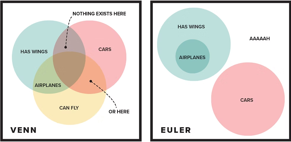
If you have ever tried to explain overlapping categories using circles, you have probably used a Venn diagram without even thinking about it. It is one of those tools that shows up in classrooms, business meetings, and data presentations because it is instantly recognizable. But Venn diagrams are not always the best way to represent relationships between groups, especially when those relationships are not perfectly symmetrical. That is where learning how to convert Venn diagram to Euler diagram becomes genuinely useful, and this article walks through the entire process in plain language.
What Makes Venn and Euler Diagrams Different
Before getting into the actual steps for how to convert Venn diagram to Euler diagram, it helps to understand why these two diagram types exist separately in the first place. A Venn diagram shows every possible logical relationship between a set of categories, even the ones that do not actually occur in real life. So if you draw a three-circle Venn diagram for cats, dogs, and reptiles, it will still show an overlapping region for “reptiles that are also dogs,” even though that combination is impossible.
An Euler diagram, on the other hand, only shows the relationships that actually exist. Circles overlap only when there is real shared data, they sit apart when there is no connection, and one circle can sit entirely inside another when one category is a subset of the other. This makes Euler diagrams more accurate but slightly less standardized in appearance, since the shapes are not forced into a fixed symmetrical pattern.
Why You Might Need to Convert a Venn Diagram Into an Euler Diagram
People usually start with a Venn diagram because it is the more familiar shape, especially from school textbooks. But once real data enters the picture, that symmetry stops making sense. If two categories never overlap in reality, forcing them into intersecting circles is misleading to anyone reading the chart.
This is exactly why so many people search for how to convert Venn diagram to Euler diagram once they move from theoretical examples to actual datasets, business categories, or survey results. The goal shifts from showing every logical possibility to showing only what is true.
Marketing teams comparing customer segments, biologists classifying species, or analysts working with membership data all run into this same issue. A clean, accurate Euler diagram communicates the real structure of the data far better than a Venn diagram that includes impossible overlaps.
Understanding the Logic Before You Start Converting
Conversion is not just a visual redraw. It requires you to actually understand the relationships between your sets first. Before touching any shapes, you need to know three things about every pair of categories in your diagram.
You need to know whether the two sets overlap at all, whether one set is completely contained inside the other, and whether the sets are entirely separate with no shared elements. Once you have this information mapped out, the actual drawing becomes much easier, because you are no longer guessing at proportions or positions.
This logical mapping step is really the heart of how to convert Venn diagram to Euler diagram. Skipping it and jumping straight to redrawing shapes usually results in a diagram that looks different but is still not accurate.
A Step-by-Step Approach to Convert a Venn Diagram Into an Euler Diagram
Once you understand the relationships in your data, the actual conversion follows a fairly predictable sequence. Start by listing every category as a separate circle, just as you would in a standard Venn diagram. Then go through each pair of circles one at a time and ask whether they genuinely share members.
If two circles share no members at all, separate them completely so they no longer touch. If one category is fully contained within another, resize and reposition the smaller circle so it sits entirely inside the larger one rather than just overlapping it. If two categories partially overlap, keep the intersection, but size it to reflect roughly how much crossover actually exists rather than using a generic equal-sized overlap.
This is the core mechanical process behind how to convert Venn diagram to Euler diagram, and it applies whether you are working with two circles or a dozen.
Identifying Which Overlaps Are Real
A lot of people get stuck at this stage because Venn diagrams train us to expect overlap everywhere. It takes a mental shift to start treating overlap as something that has to be earned by actual shared data rather than assumed by default.
Go back to your original dataset or category list and check each intersection individually. Ask a direct question for each one: does anything actually belong to both of these groups? If the honest answer is no, that overlap needs to disappear in your final diagram, even if it existed in the original Venn version.
Removing Empty or Impossible Regions
Every unnecessary overlap or impossible category combination in the original Venn diagram represents an empty region that needs to be eliminated. This is often the most satisfying part of the process because the diagram starts looking noticeably cleaner and more truthful.
Empty regions are not just visually confusing, they can actively mislead a viewer into thinking a relationship exists when it does not. Removing them is not optional if accuracy matters, and it is one of the main reasons people bother learning how to convert Venn diagram to Euler diagram in the first place rather than just sticking with the familiar format.
Redrawing the Shapes to Reflect Actual Relationships
With the logical groundwork done, redrawing becomes mostly a design task. Circles that fully contain another category should be drawn noticeably larger, with the smaller circle positioned well inside its boundary rather than just touching the edge. Circles with no relationship should have visible space between them so there is no ambiguity about their separation.
For partial overlaps, try to keep the size of the intersection proportional to the actual amount of shared data, even if it is just a rough visual estimate rather than a mathematically precise one. This proportional approach is what gives Euler diagrams their reputation for being more informative than standard Venn diagrams, since the shapes themselves start to carry real meaning.
Manual Conversion Versus Using Diagramming Software
You can absolutely do this conversion by hand with paper and a compass, and for simple two or three category diagrams that is often the fastest approach. But once you are working with more categories or need something polished for a presentation, diagramming software makes the process considerably easier.
Most modern diagramming tools include an Euler diagram option separate from the standard Venn template, and some will even auto-generate proportional overlaps if you input actual numeric data for each category. This removes a lot of the guesswork involved in estimating overlap size by hand.
Either way, the underlying logic of how to convert Venn diagram to Euler diagram stays the same. Software just speeds up the redrawing and resizing steps once you have already worked out which relationships are real.
Common Mistakes People Make During Conversion
One frequent mistake is keeping symmetrical circle sizes out of habit, even when the underlying categories are wildly different in size. An Euler diagram does not require equal circles, and in fact, using different sizes to represent different category sizes is one of its strengths.
Another common error is forgetting to fully enclose subset relationships. If one category is entirely part of another, a partial overlap is not accurate. The smaller circle needs to sit completely inside the larger one with no part of it sticking outside.
People also sometimes rush the logical mapping stage and go straight to redrawing shapes based on intuition rather than actually checking the data. This defeats the purpose of the exercise, since the whole point of learning how to convert Venn diagram to Euler diagram is to end up with something more accurate, not just something that looks slightly different.
A Practical Example of the Conversion Process
Imagine a simple dataset involving three groups: people who own a car, people who own a bicycle, and people who use public transportation. In a standard Venn diagram, all three circles would overlap evenly by default, suggesting a fairly even mix of all combinations.
But suppose your actual data shows that almost everyone who uses public transportation also owns a bicycle, while car ownership is a mostly separate group with only slight overlap with the other two. Converting this into an Euler diagram means shrinking the public transportation circle so it sits mostly inside the bicycle circle, and pulling the car ownership circle further away with only a small intersection remaining.
The result is a diagram that instantly communicates the real structure of the data, which is exactly the outcome you want when you convert a Venn diagram into an Euler diagram for a real audience.
When It Makes Sense to Keep the Venn Diagram Instead
Not every situation calls for conversion. If you are teaching basic set theory or logic and specifically want to show every possible combination, including the impossible ones, a Venn diagram is still the right tool. The whole point of a classic Venn diagram is to display all logical possibilities regardless of whether they occur in reality.
Conversion only makes sense when your goal shifts from showing logical possibility to showing actual truth. If you are presenting real data, real categories, or real relationships between groups, that is the moment when learning how to convert Venn diagram to Euler diagram becomes genuinely worth the effort.
Final Thoughts
Converting a Venn diagram into an Euler diagram is really about shifting your mindset from theoretical completeness to practical accuracy. It requires understanding your data first, mapping out which relationships are real, and then redrawing your shapes to reflect only those genuine connections.
Whether you do this by hand or with software, the underlying process stays consistent: identify real overlaps, eliminate impossible ones, adjust sizes to reflect actual proportions, and make sure subset relationships are fully enclosed. Once you get comfortable with these steps, converting between the two diagram types becomes second nature, and your visuals end up telling a far more honest story about the data behind them.
